Redesigning the Soviet Wonders tour company brand that sells tours to the post-soviet world in Ukraine.
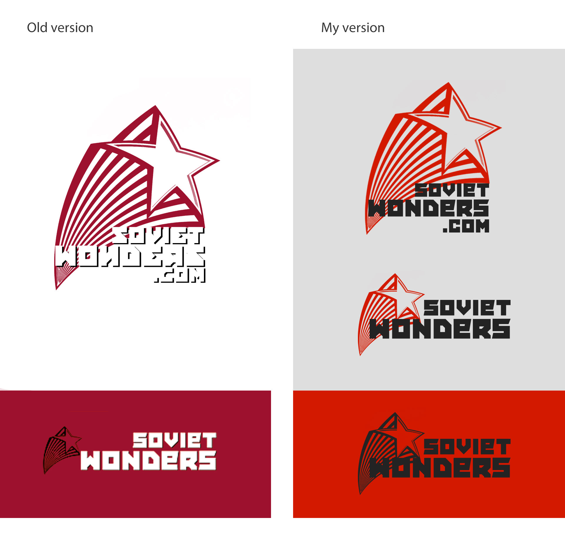
Logo
The Chernobyl Tour is unforgettable and absolutely unique for all who experience it. So, for the website and any other company's products, this is the "style matters" case.
Colors, fonts, and elements match the Soviet and Chernobyl visuals.
Colors, fonts, and elements match the Soviet and Chernobyl visuals.
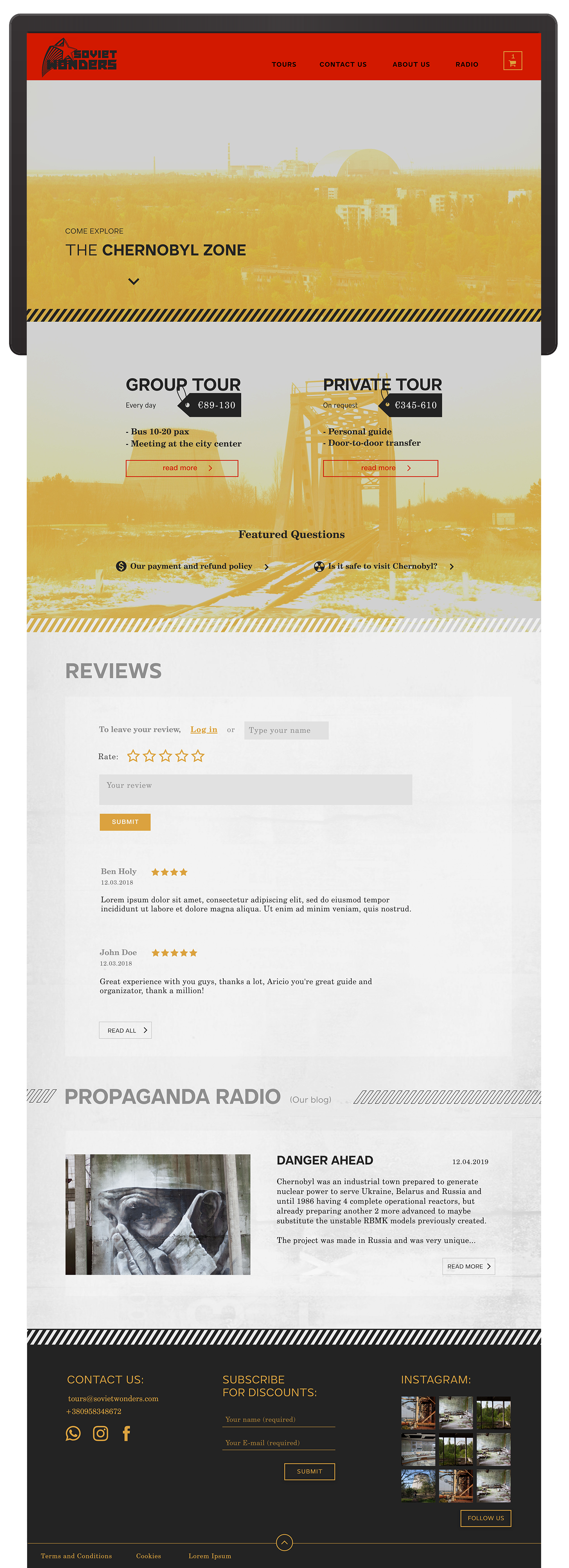
New website
(Child website of Soviet Wonders: Chernobyl tours only)
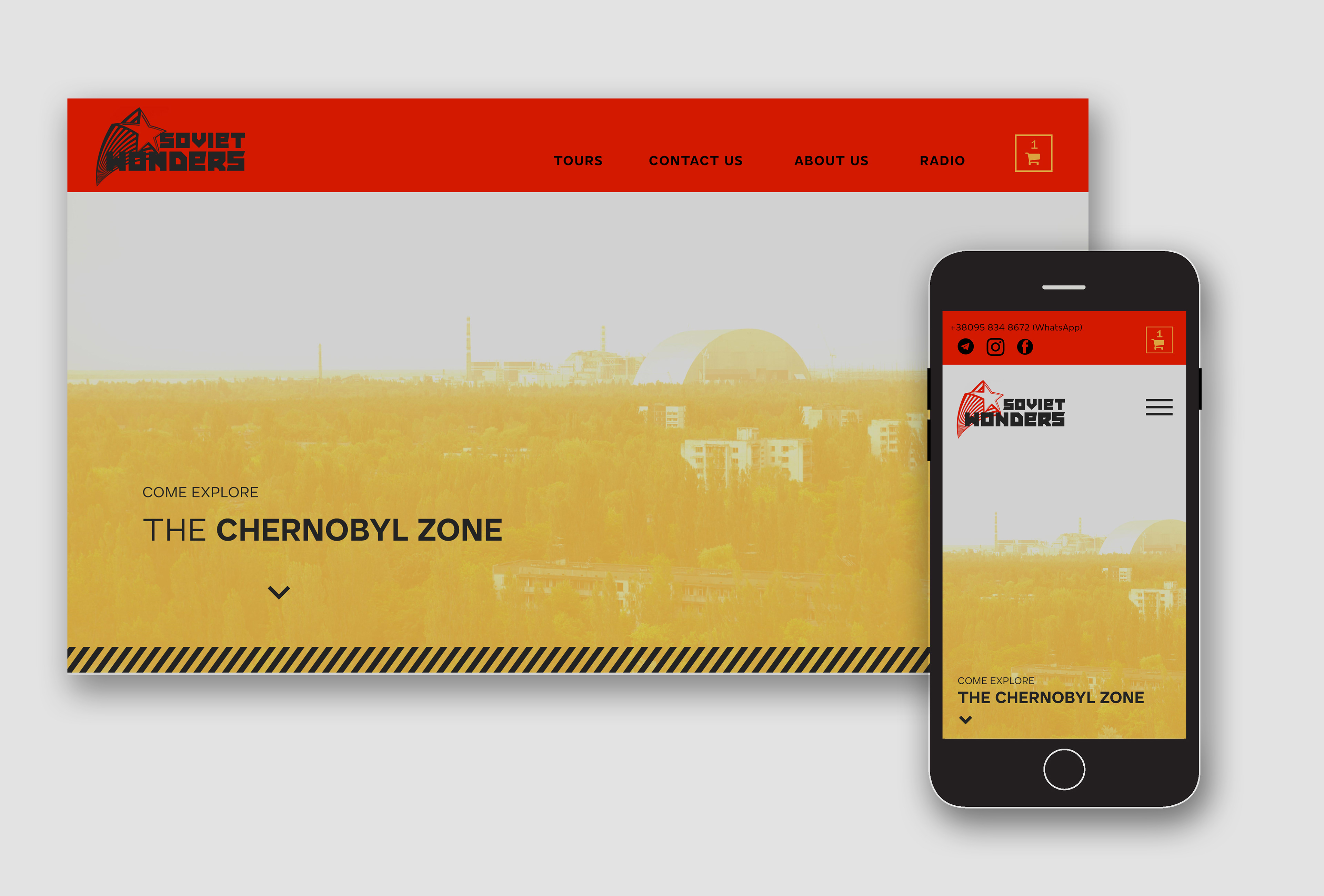
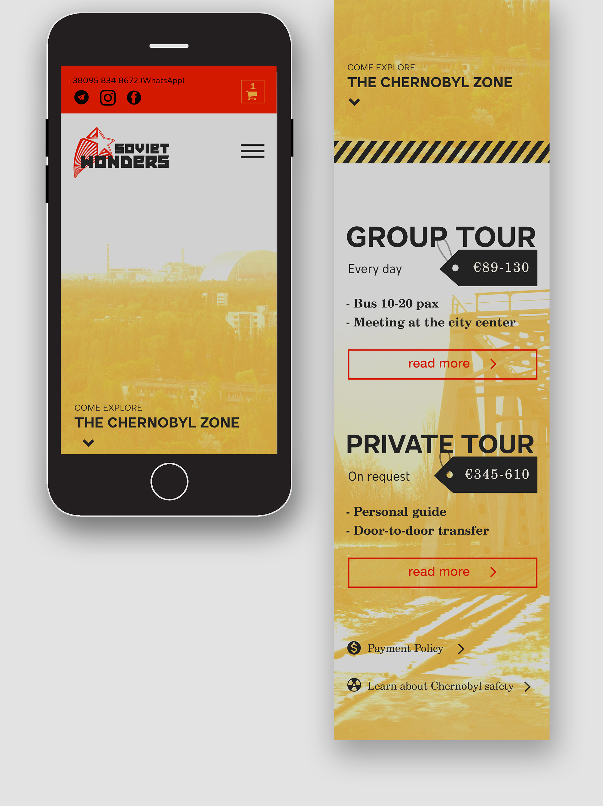
The website is adjusted for different platforms:
On the main page, customers can access both types of tours:
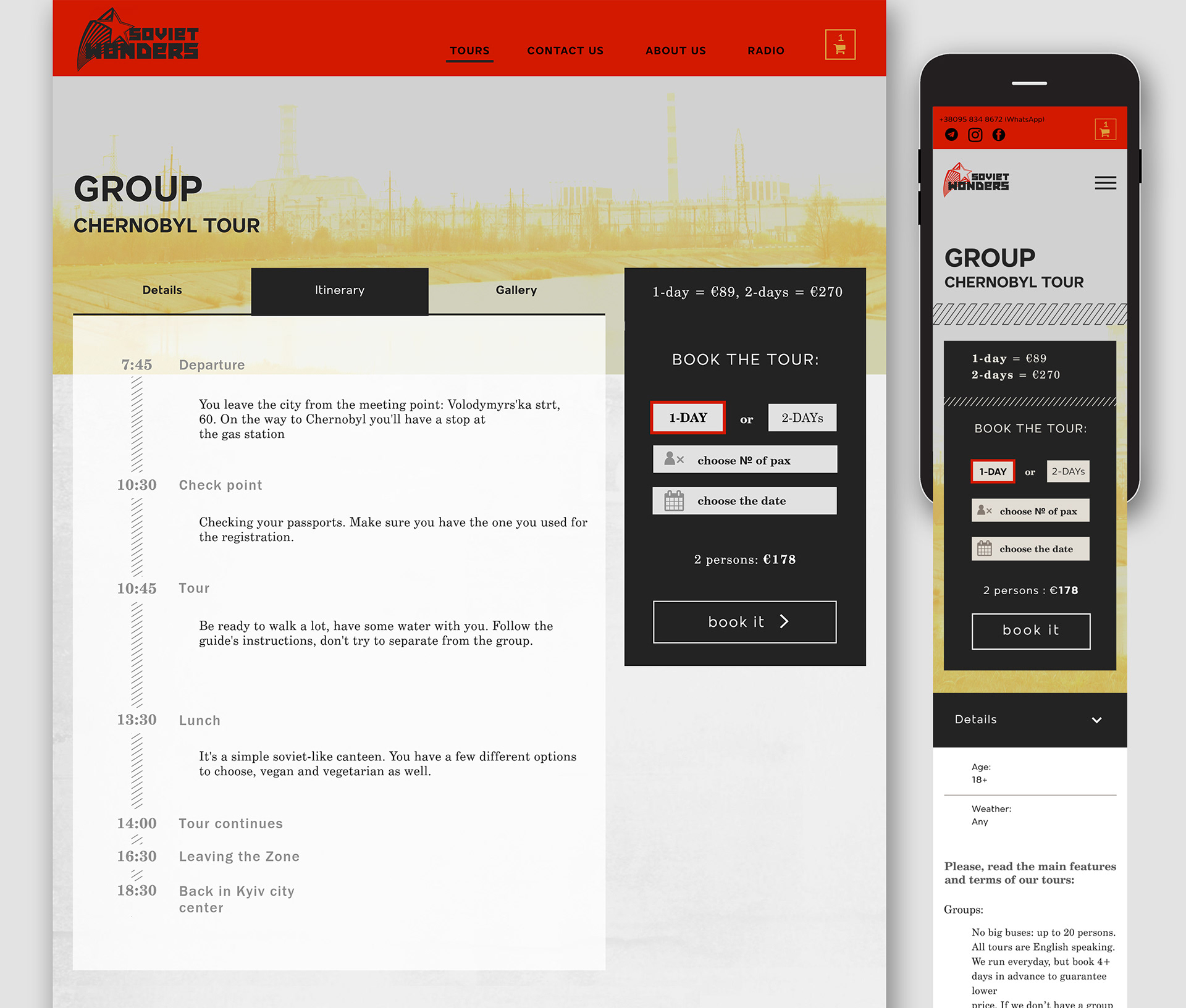
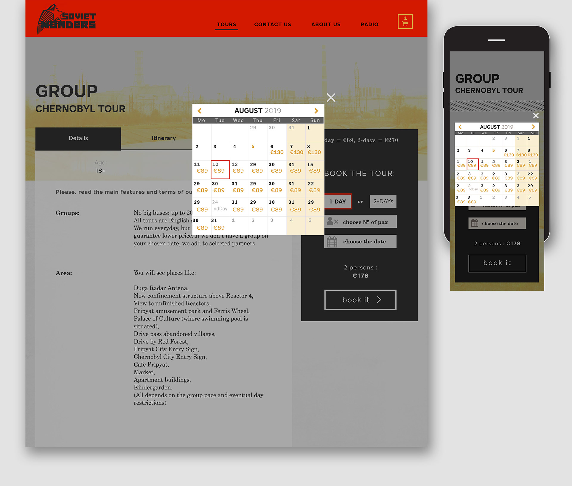
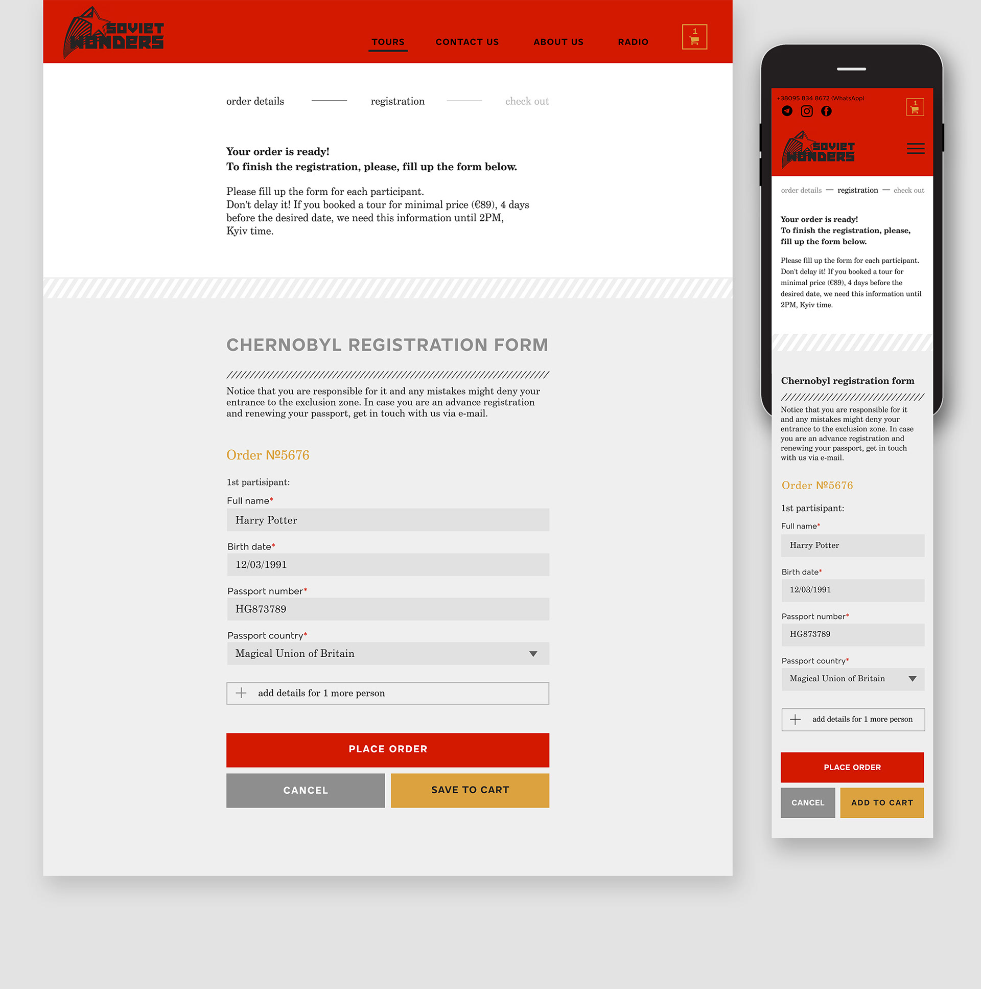
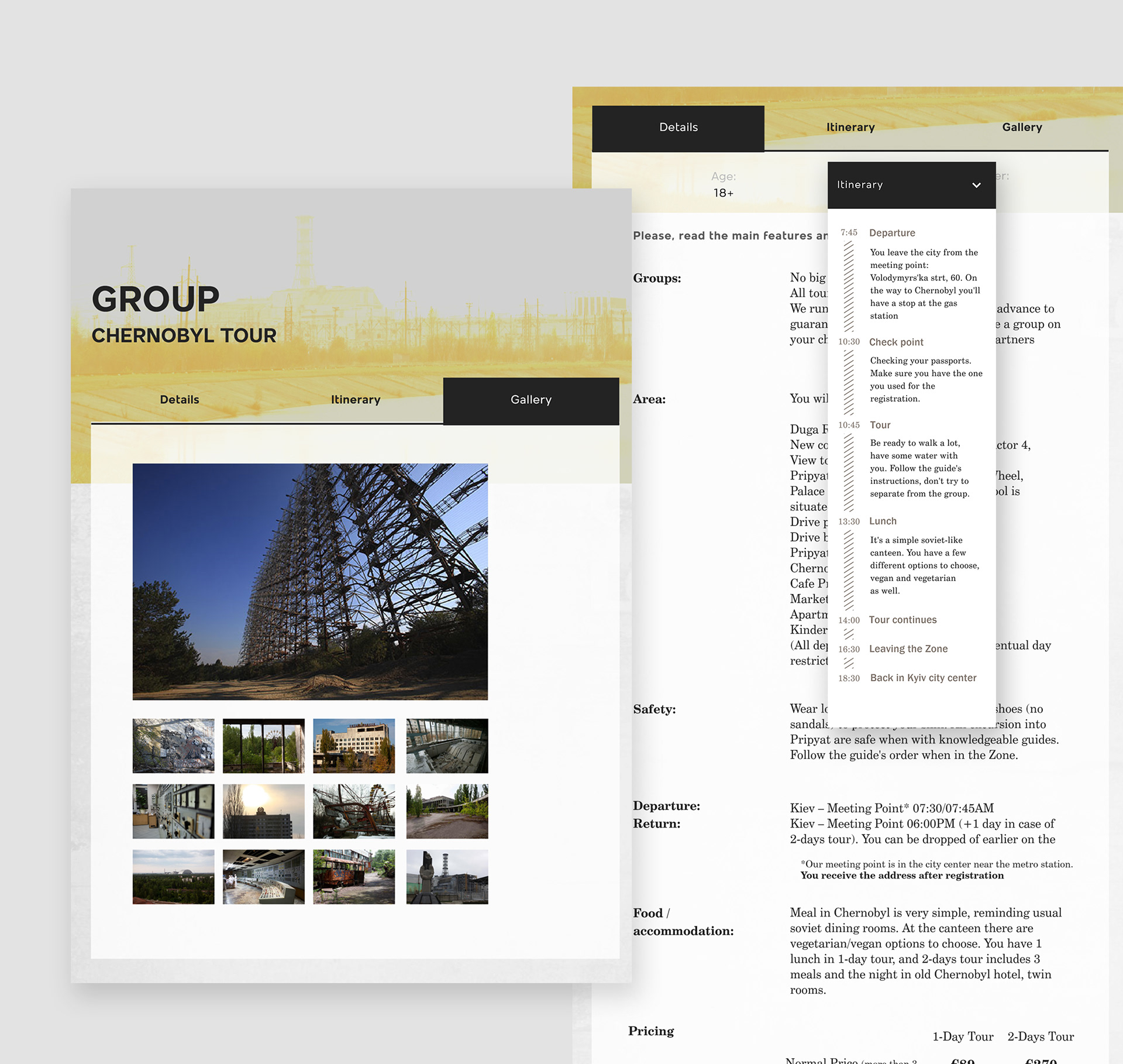
The tour page has all relevant information conveniently organized in tabs, and a quick booking card. The interface elements and content are structured according to the hierarchy:
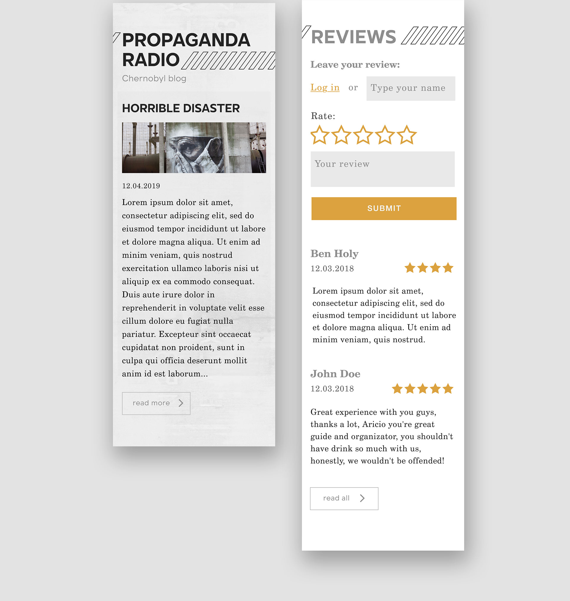
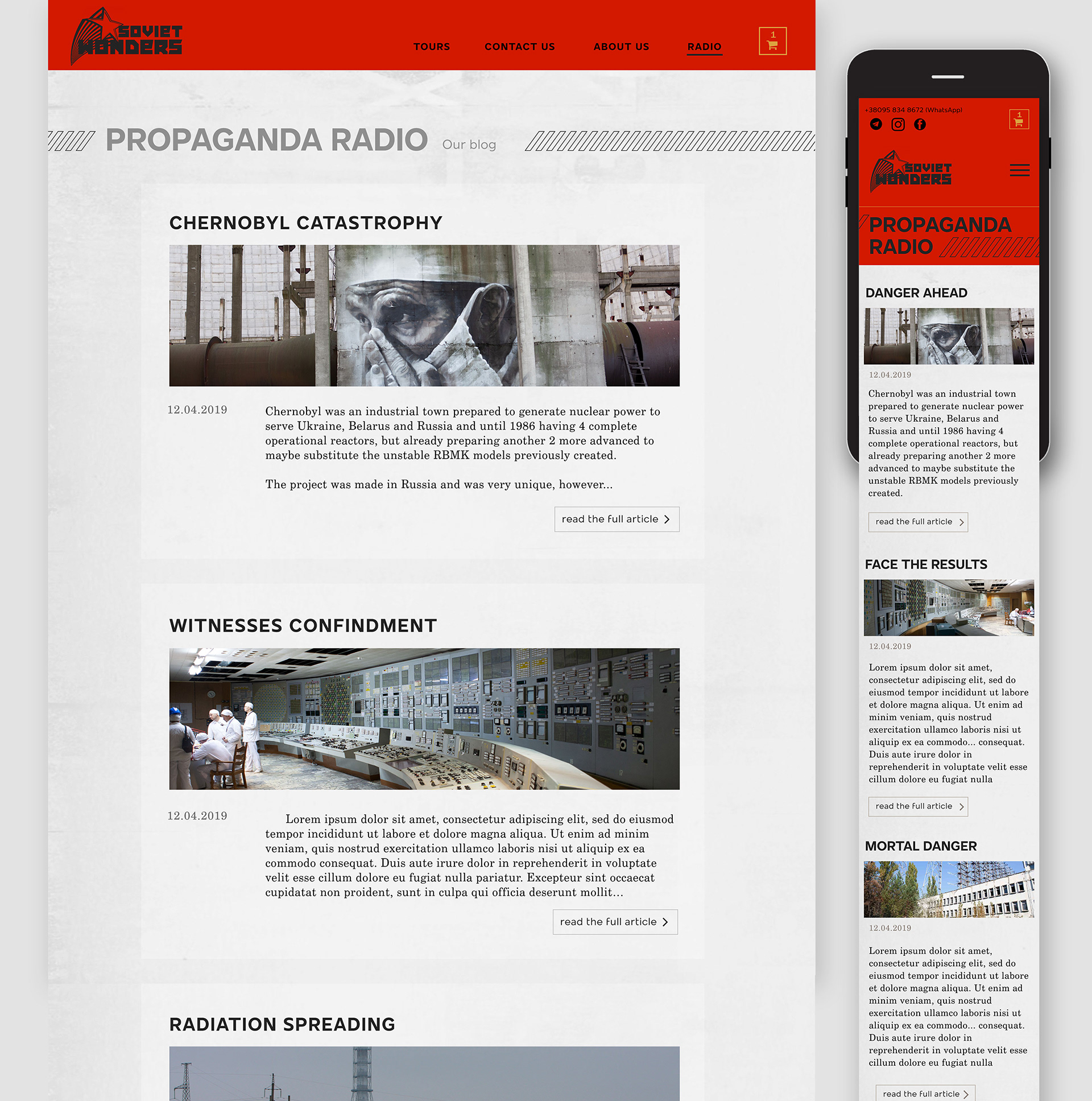
And a nice blog:
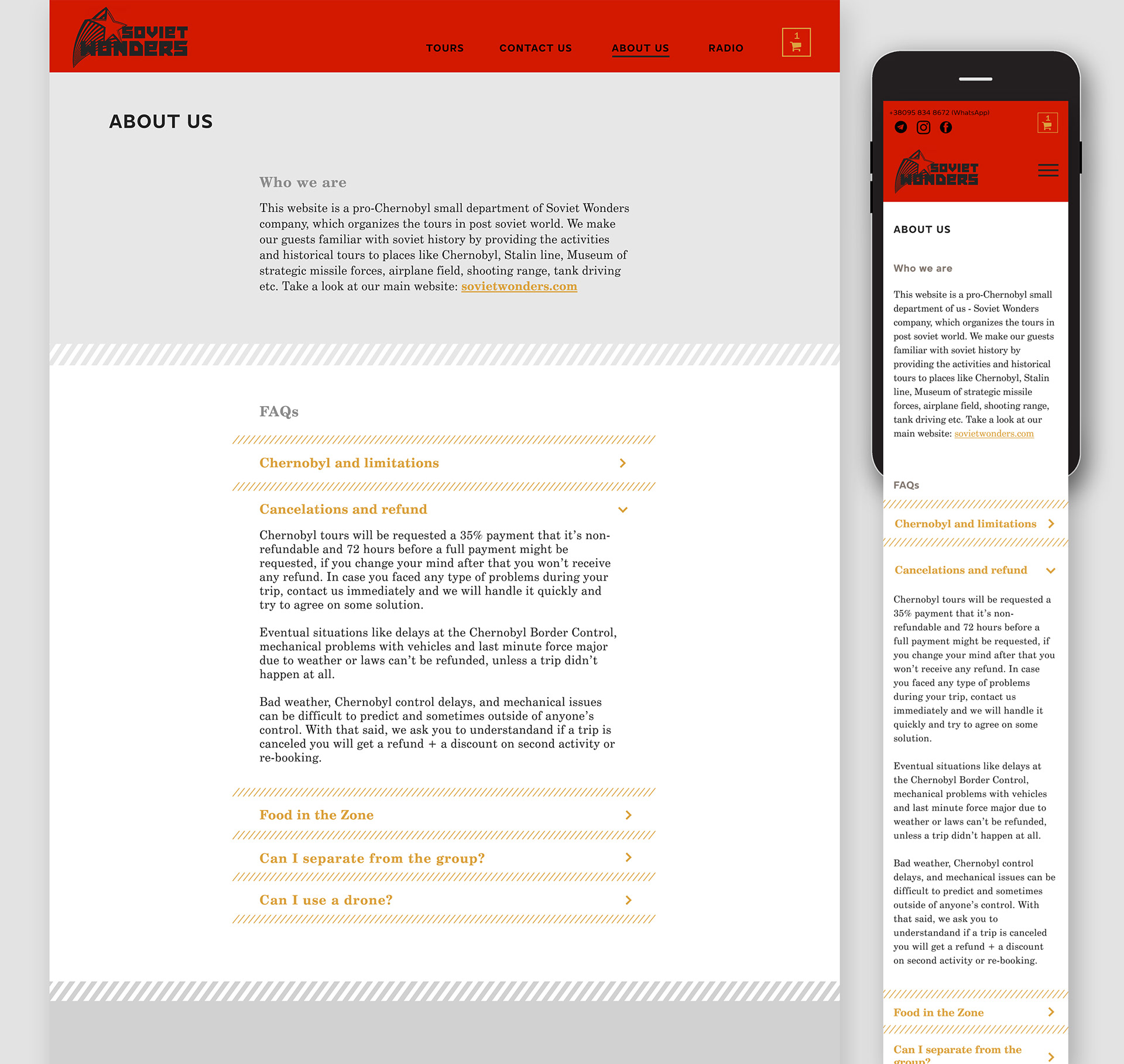
...And info page:
Tabs on desktop and mobile:
Thank you :)