---- Designed in Figma ----
Being built with Flutter (Material components)
Project overview
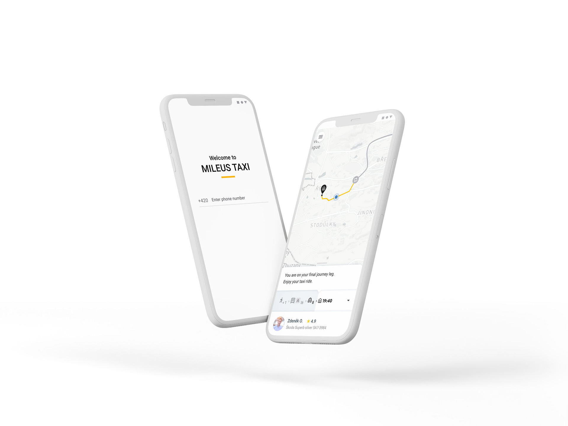
With a combination of taxi and public transport, the passenger can quickly get out of the traffic using the metro, and his taxi will already wait for them at the nearest convenient station. All the route is managed in one smartphone application.
My role
As the solo product designer in the company, I executed on all elements of the design process, starting with research. I investigated products that overlapped with Mileus by the problems they solved, from governmental public transportation websites to Uber. Initial wireframes were tested both within the team and with an external audience. Additionally, I built an interactive prototype, which served for user experience testing and provided me with both qualitative and quantitative feedback. You can find a video recording of the prototype below.
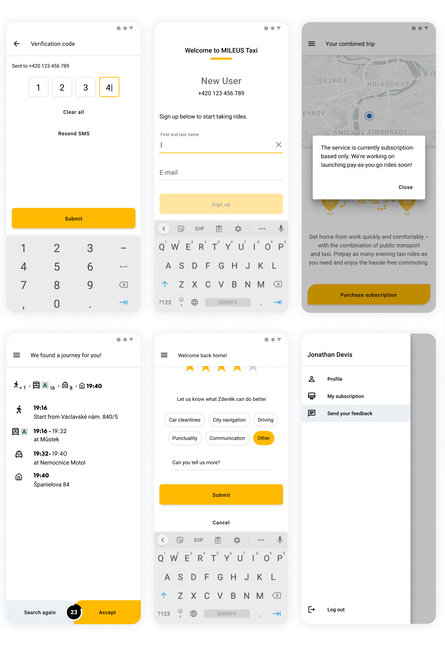
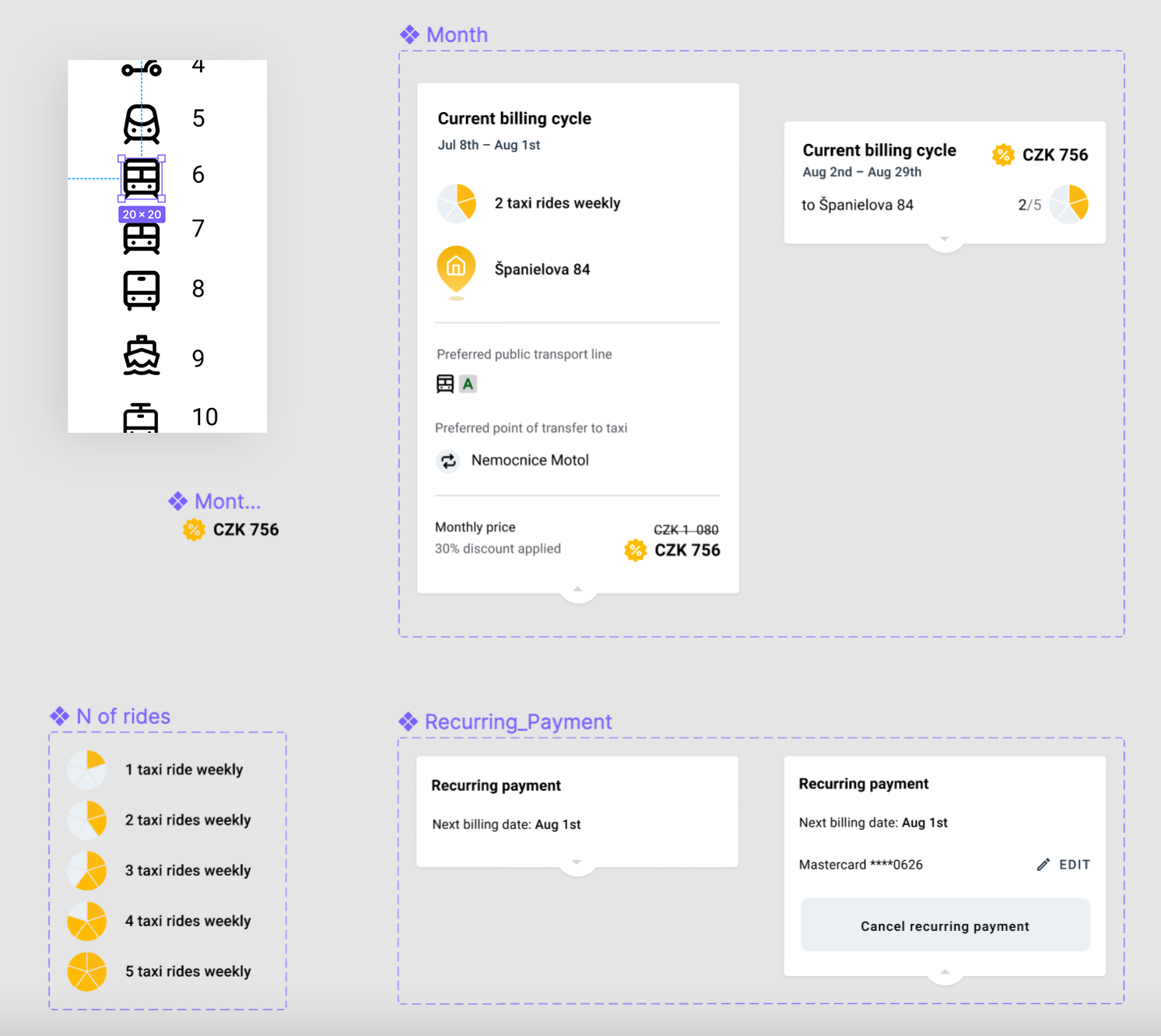
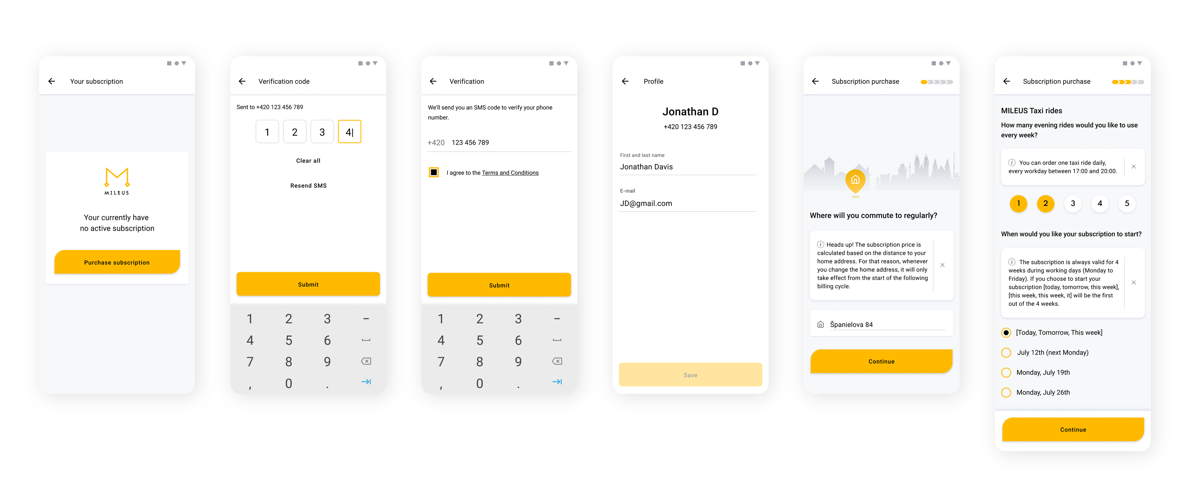
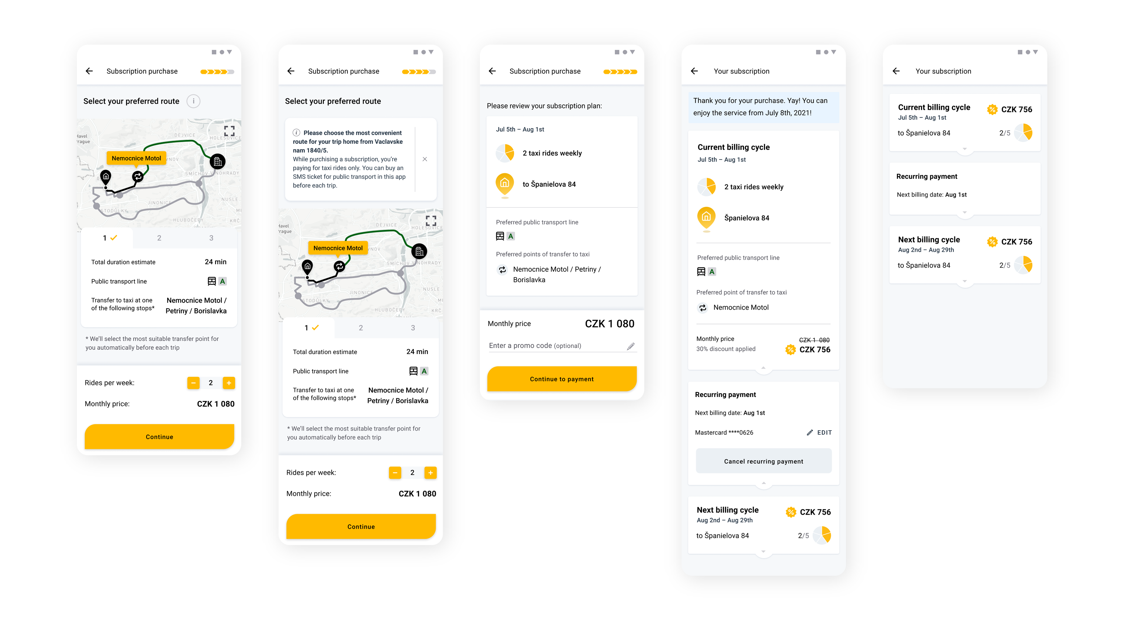
Purchase of the monthly subscription for the combined rides
The service is subscription-based only, and subscription purchase is a complex process; for user convenience, it was divided into a few steps, with the quick inputs unique for each step, and dismissible tips guiding the user through a process. Some data is hidden inside the expandable panels or tabs, saving the phone screen space, although still being easy to discover.
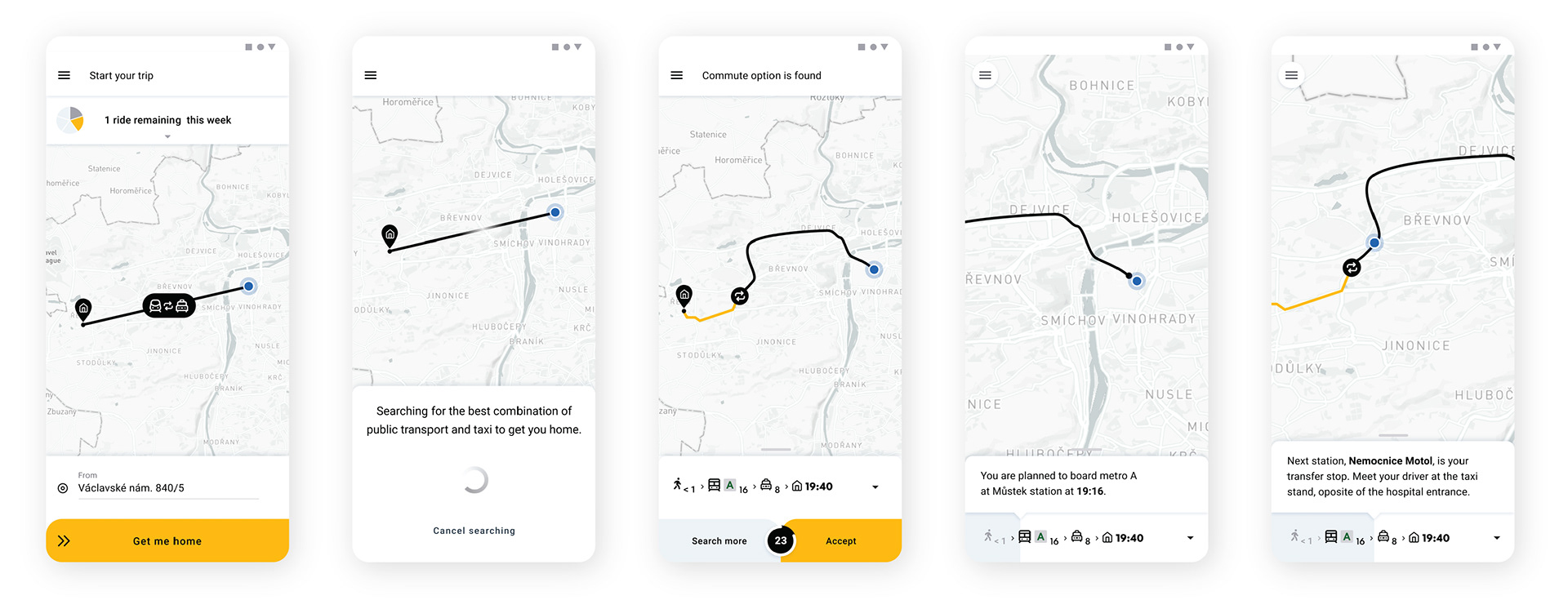
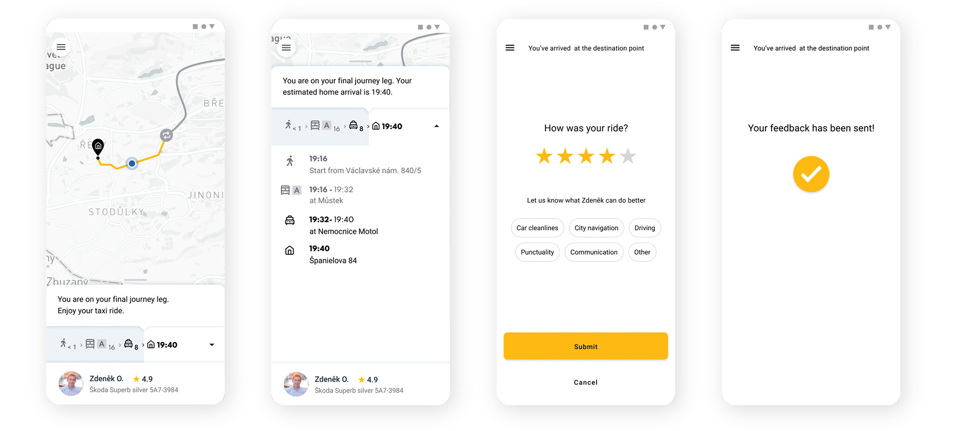
Combined ride flow
In the ride flow, the user follows the real-time guidance of his ride, he can see both a short pictogram progress indicator with a map and an expanded detailed route.
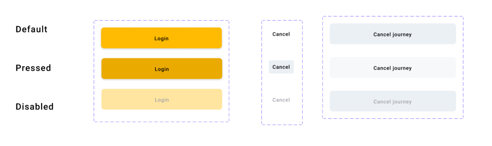
The design is based on Google's Material Design guidelines. Most layout elements are the standard Material components, tweaked a bit to match the Mileus established brand style. Some elements are specific, and they needed to be built from scratch to fulfill the unique functionality, like Accept/SearchAgain button pair combined with the countdown.
Layouts in Figma were built using components, including also their variations (states), and nested components.
UX testing and the following changes
After the UX test had been conducted, we analyzed the misunderstanding that occurred, and I updated the design, to make every element's functionality more clear. We worked on the small visual changes and the copy mostly.
Some examples are given below.
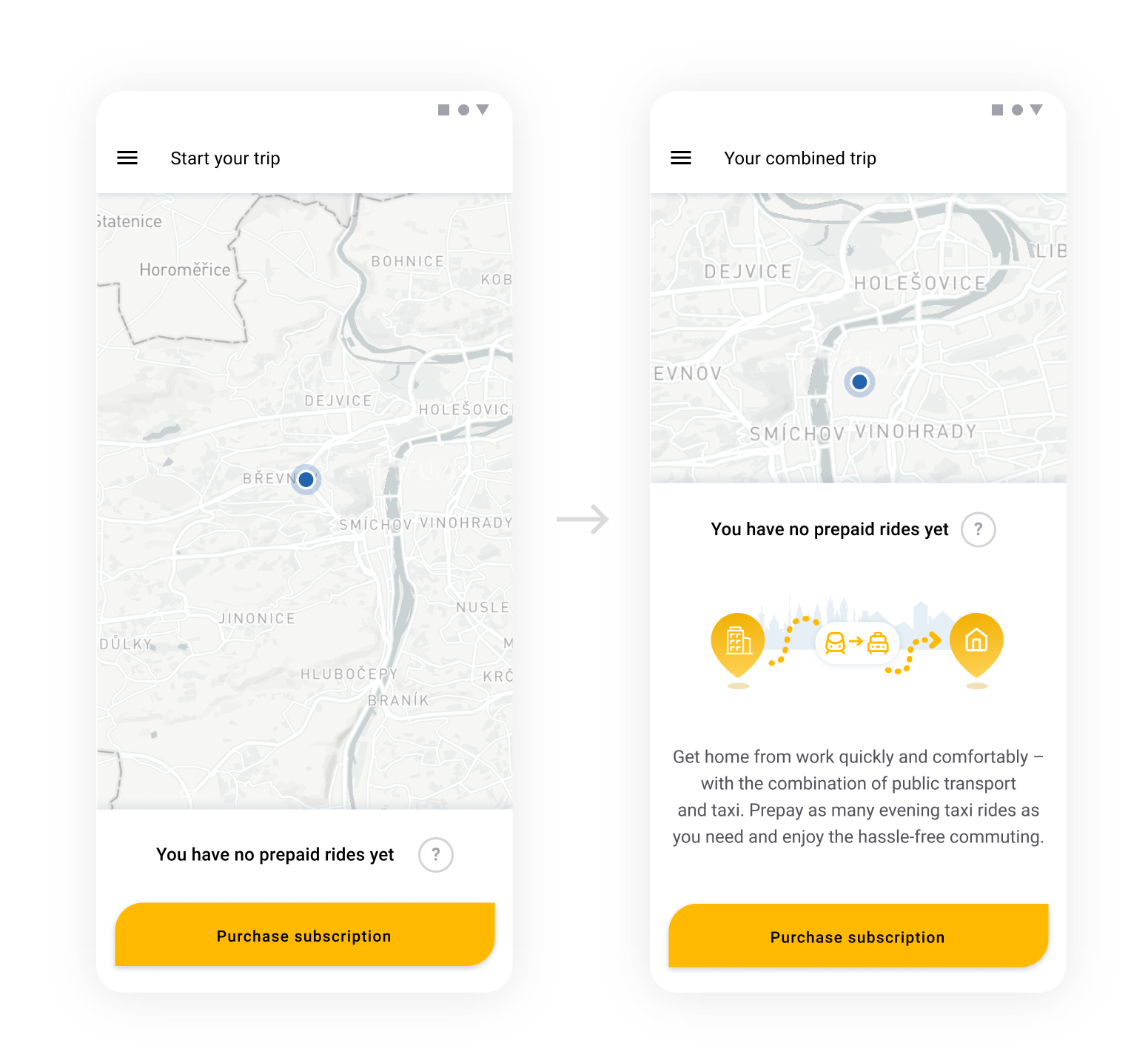
The home screen tells the users that there are no available rides (you have to prepay a month of subscription to use the service), but it was confusing for them. They needed a better explanation of how the service works, to be motivated to buy a subscription.
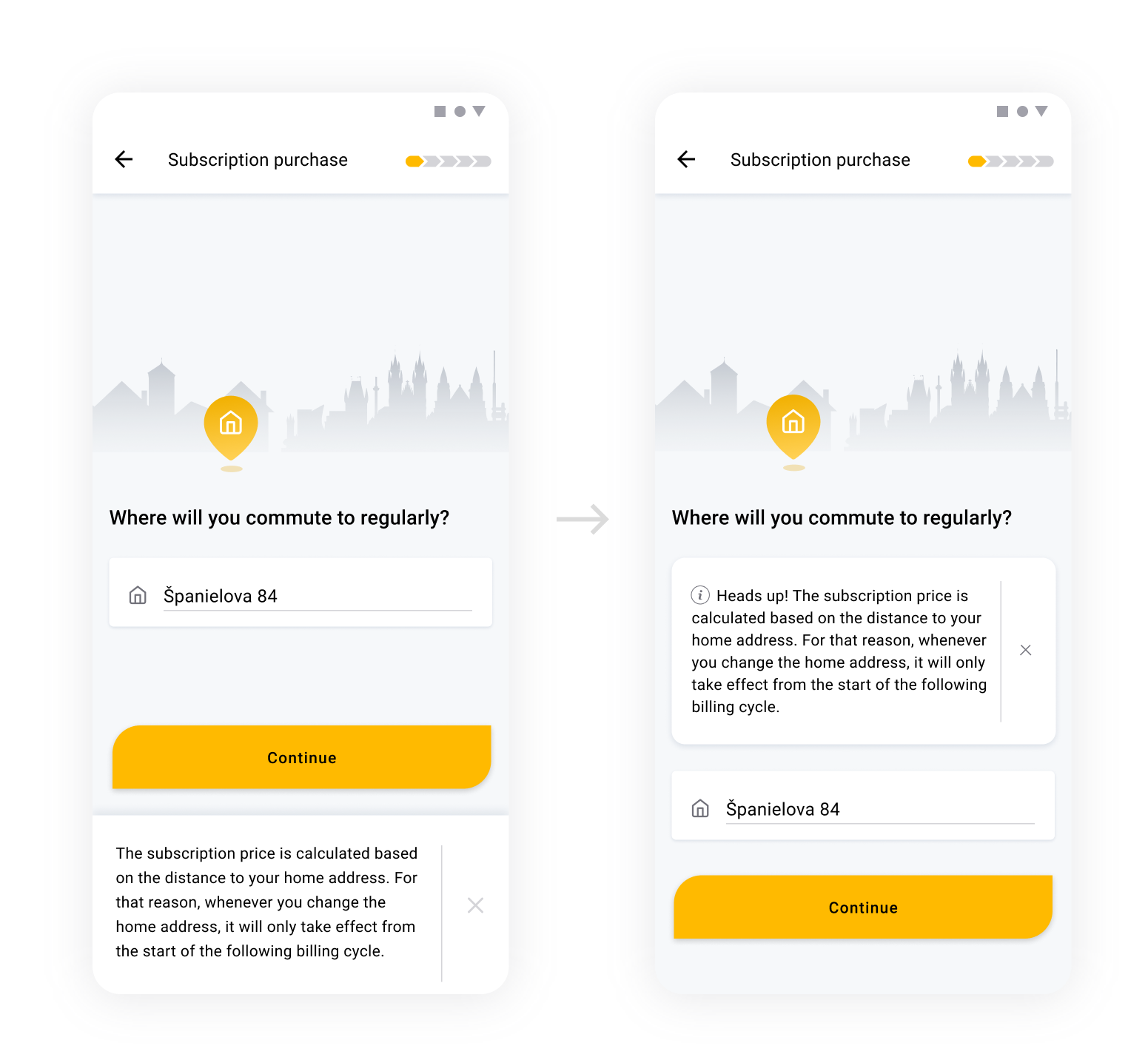
The users were overlooking the tips we provided during the complex process of the subscription purchase. They didn't even read the dismissible tips sticking to the bottom of the screen, as they thought it was some cookie banner. I placed the tip right under the headline and changed the design to make it look more like an informational message.
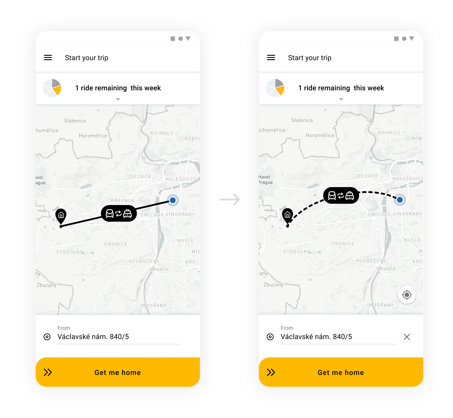
The default straight line I used as a placeholder for the route on the map was confusing for the users – they thought it was already a rendered route of their journey. So I changed the placeholder to make it look more like a blueprint, an illustration of the commute.
The next iteration of the testing demonstrated that the updates improved UX.
Check Mileus website to learn more about their technologies and products.
Thank you!
