Facebook design was a pain for many years. Most of my Ukrainian friends (and not only friends) complain a lot about the inconvenience of use and visual clutter, as they got used to VKontakte platform, which is way more cleaner, and I will come back to that example later. Recently, Facebook redesigned their platform, using the modern design trends, and... yes, it looks modern now. But the problem isn’t solved.
So, what’s exactly wrong with that design concept? When you open Facebook website, there are too many things trying to attract your attention, too many images, buttons, notifications, functions, suggestions, and its even worse if some of them are animated. Yes, I know that Facebook is trying to make people involved in the interaction, providing as many tools and entertainments as possible, which results in the “blinded” effect, meaning you try to ignore 98% of elements and just learn to use 1-2 functions. There is a well-known rule in the Interaction Design: the more options user sees, the lower chances he will choose any of them.
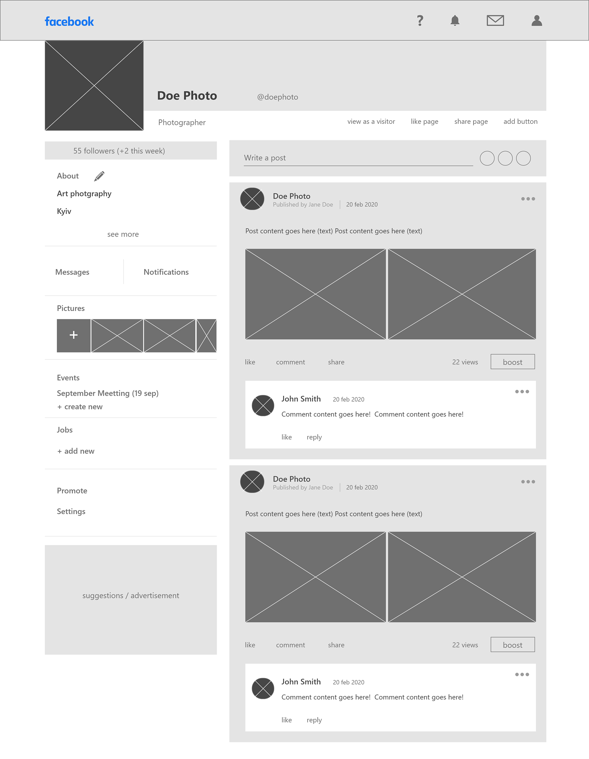
Let’s have a closer look. I used my own public page that I made in 2015 to publish my art photos, but I didn’t really use it a lot, because I was annoyed of the experience. Here is the new design, and still so many things that I’d remove.
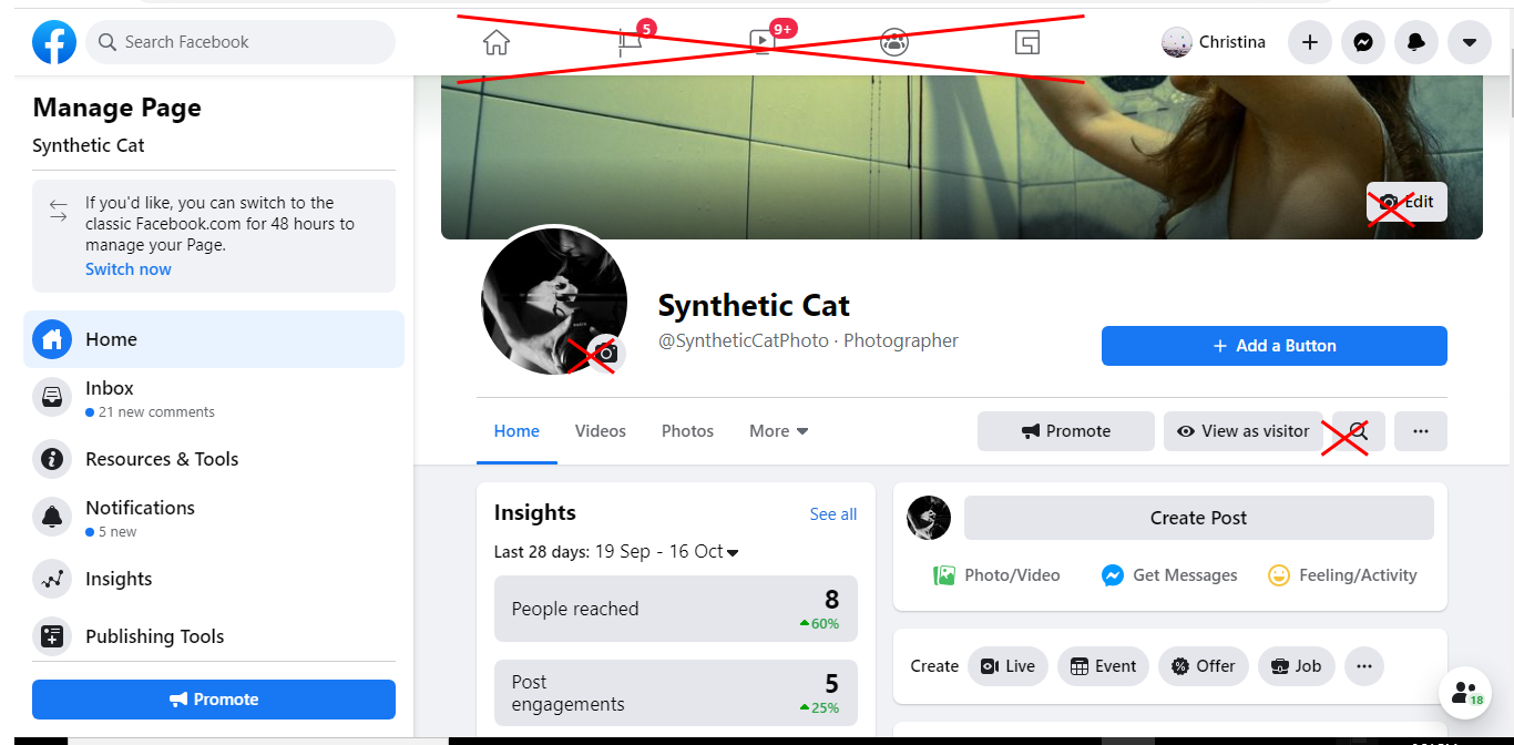
What are all those icons in the header? Videos, gaming... Why should we see them on every page, and why they disturb our eyes with red circles of updates / notifications? Are they important? Why don’t hide them somewhere in the menu?
Why show camera icon on my cover / avatar pictures all the time? Those icons tell you that you can change the picture by clicking on them, but they can appear on hover or in the coaching tour for new users. For those who use social media for many years, changing picture is very obvious thing.
I don’t need a huge distracting “Add a button” button always present on my page. This is an extra function I should be aware of, but damn, hide it somewhere in the settings menu and I’ll get back to it when I need it. Neither I need a search function in my page.
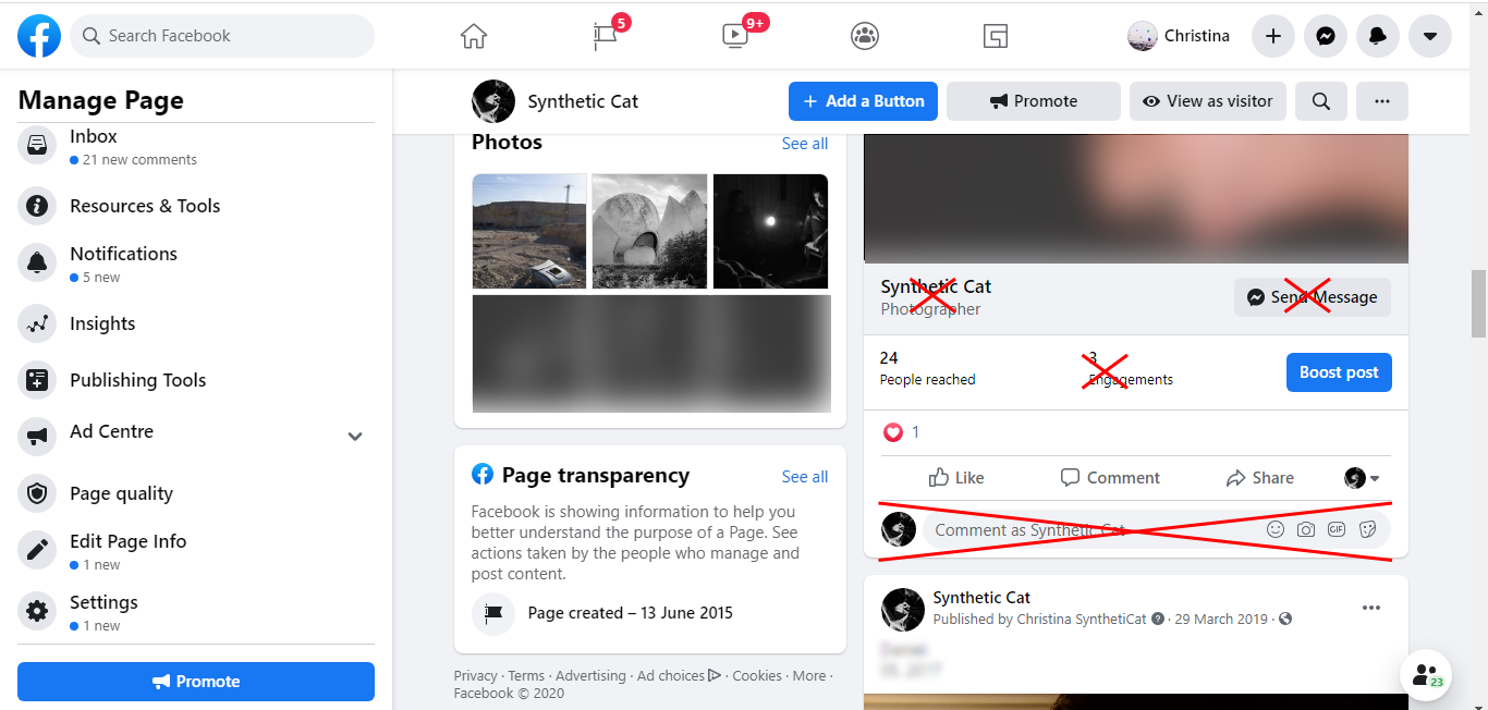
I don’t need to see the name of my page below my EVERY post, neither I need a “send a message” button there.
Also, how often do you write comments to your own posts? I mean, not a reply to someone’s comment, but a direct one? If I need to do it, I click a comment icon to open an input field. Before I need that – I prefer no input field with my avatar to appear there.
I don’t want to see a “promote” button duplicated on my page. Yes, dear Facebook, I know you want to make money by kindly helping me with your ads, but if I really need that, I will find the function easily, if you put it somewhere in the functions list.
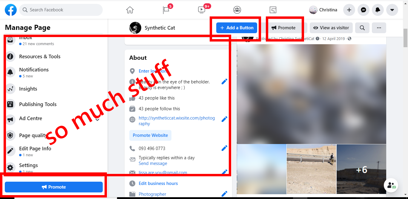
I see so many info cards about my page and so many tools on those two big bars on the left. Why they should always be there?
So, I complained about all the things I don’t want to have on my public page. What do I want to have there then? On the wireframes below, I located the most important elements.
Let’s define the main functions users need on that type of page:
Of course, there still should be a header to navigate you quickly to your personal page, your messages or urgent notifications.
On the page itself should appear main photo and a possibility to add a cover photo. Also, you probably need a button to quickly share this page or to view it as a visitor. The other itching need is the wish to see the number of your followers.
The core thing of your page is a content you publish, so the posts (but not the additional info or tools) should be highlighted. There you see, obviously, who posted, when, who commented, likes, shares, etc. Extra functions are hidden in the three-dots menu icon.
You should be able to review and edit all the info about yourself / your business, and you want some statistic also, but not everything on one page. You see a preview, a piece of info, and just with one click you can expand the full list or visit the statistic page.
Of course, you need to be notified of the messages / comments and changes in your page.
Also, you need to have access to the main options like setting the events, jobs, promoting your page etc, and all of them I put in the left bar.
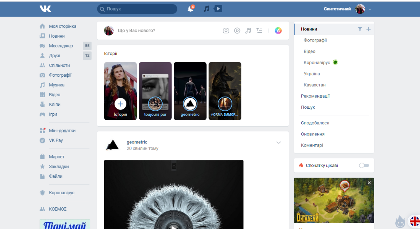
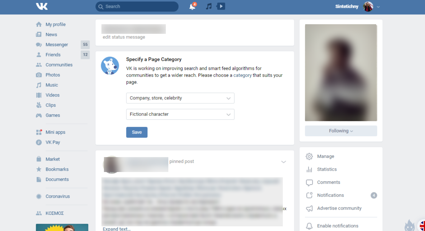
Before I expose the final design, I want you to check the examples of other social media, designed better than Facebook. I know that Vkontakte stole Fb’s idea, but… It’s like a cover for a song, you know. Sometimes cover is better.
And, finally, here is my design of the Facebook public page, built on the 12-column grid:
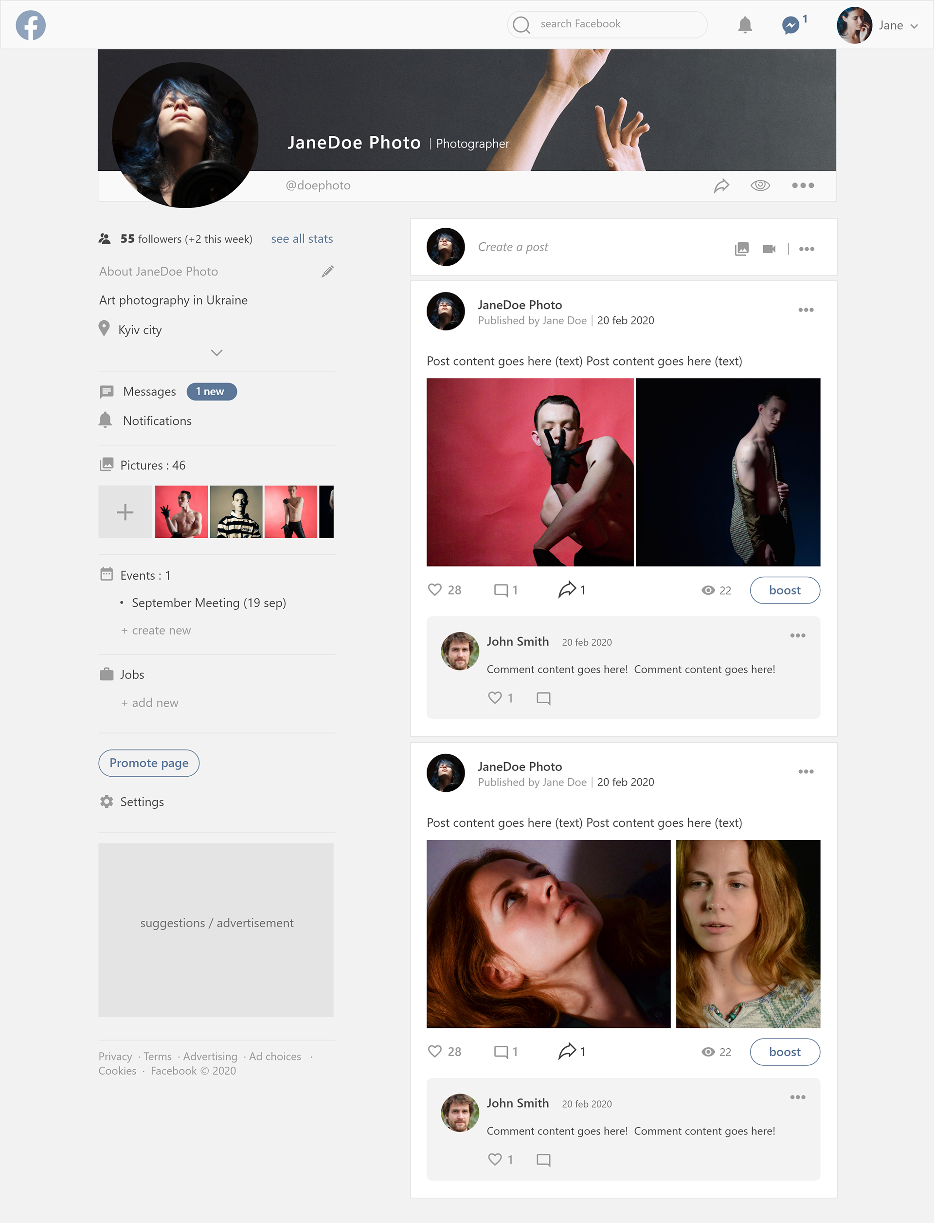
This is the interface I like way more than the existing one, and I wonder how many users can share my feelings : )
Dont hesitate to contact me if you want to talk.
Dont hesitate to contact me if you want to talk.